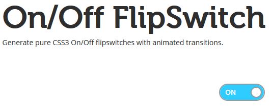
El CSS3 unido con el HTML5 consigue efectos sorprendentes, creo que aún nos queda mucho que avanzar en este sentido. En el artículo de hoy podrás ver como crear fácilmente botones tipo on/off (de encendido/apagado) con CSS3.
On/Off Flipswitch es una herramienta online con la que podrás ir configurando tus botones paso a paso.
¿Cómo lo configuro?
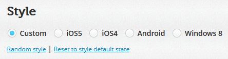
1. Defines el estilo general
Puedes escoger entre estilo personalizado, tipo iOS5, iOS4, Android y Windows 8.
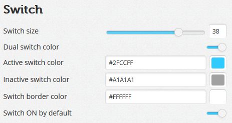
2.- Concretas el estilo más detalladamente sobre ese estilo general escogido en el paso anterior.
Tamaño, borde, si está activado el on, colores,… son algunas de las opciones que podrás determinar en esta parte.
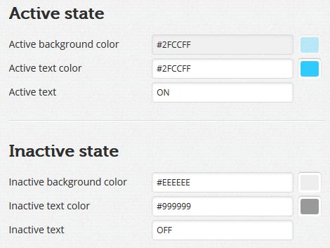
3.- Define el estado activo e inactivo
Podrás definir color de fondo, color de texto y el texto que va a tener cada botón.
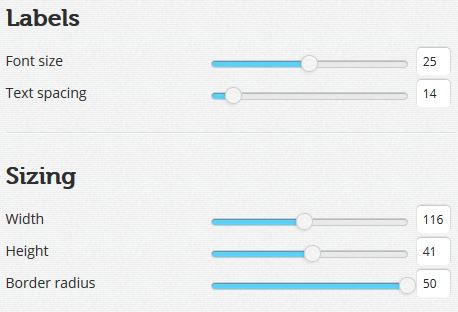
4.- Define más estilos
Aquí vas a definir tamaño del texto, espacios, ancho, alto y radio del borde.
5.- Generación del CSS y HTML
Según lo que hayas elegido se te genera el código CSS y HTML correspondiente a tus elecciones del botón del formulario.
En este caso el CSS será:
    .onoffswitch {
    position: relative; width: 116px;
    -webkit-user-select:none; -moz-user-select:none; -ms-user-select: none;
    }
    .onoffswitch-checkbox {
    display: none;
    }
    .onoffswitch-label {
    display: block; overflow: hidden; cursor: pointer;
    border: 2px solid #FFFFFF; border-radius: 50px;
    }
    .onoffswitch-inner {
    width: 200%; margin-left: -100%;
    -moz-transition: margin 0.3s ease-in 0s; -webkit-transition: margin 0.3s ease-in 0s;
    -o-transition: margin 0.3s ease-in 0s; transition: margin 0.3s ease-in 0s;
    }
    .onoffswitch-inner:before, .onoffswitch-inner:after {
    float: left; width: 50%; height: 41px; padding: 0; line-height: 41px;
    font-size: 25px; color: white; font-family: Trebuchet, Arial, sans-serif; font-weight: bold;
    -moz-box-sizing: border-box; -webkit-box-sizing: border-box; box-sizing: border-box;
    }
    .onoffswitch-inner:before {
    content: "ON";
    padding-left: 10px;
    background-color: #EEEEEE; color: #2FCCFF;
    }
    .onoffswitch-inner:after {
    content: "OFF";
    padding-right: 10px;
    background-color: #EEEEEE; color: #999999;
    text-align: right;
    }
    .onoffswitch-switch {
    width: 38px; margin: 1.5px;
    background: #A1A1A1;
    border: 2px solid #FFFFFF; border-radius: 50px;
    position: absolute; top: 0; bottom: 0; right: 71px;
    -moz-transition: all 0.3s ease-in 0s; -webkit-transition: all 0.3s ease-in 0s;
    -o-transition: all 0.3s ease-in 0s; transition: all 0.3s ease-in 0s;
    }
    .onoffswitch-checkbox:checked + .onoffswitch-label .onoffswitch-inner {
    margin-left: 0;
    }
    .onoffswitch-checkbox:checked + .onoffswitch-label .onoffswitch-switch {
    right: 0px;
    background-color: #2FCCFF;
    }
Y el HTML
<div class="onoffswitch">
<input type="checkbox" name="onoffswitch" class="onoffswitch-checkbox" id="myonoffswitch" checked>
<label class="onoffswitch-label" for="myonoffswitch">
<div class="onoffswitch-inner"></div>
<div class="onoffswitch-switch"></div>
</label>
</div>
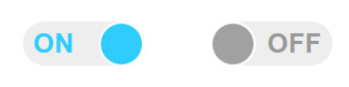
¿Cuál es el resultado final?
Como puedes ver el resultado final son dos botones css elegantes, con un diseño enfocado a que los visitantes pulsen en el botón.
¿Te animas a crear tu propio botón ON/OFF?