Aprende paso a paso como rotar iconos con CSS y HTML. Si quieres crear iconos con CSS que roten sobre sí mismos estás en la página adecuada. Podrás ver como con HML y CSS se puede conseguir que nuestras páginas webs sean más dinámicas, atractivas y que toquen la sensibilidad del usuario.
Así pues, me dejo de preámbulos y vamos al código:
Código HTML
En el código HTML tenemos indicados en una lista los iconos:
<div class="main-wrapper">
        <i class="material-icons">attach_file</i>
        <i class="material-icons">settings</i>
        <i class="material-icons">refresh</i>
        <i class="material-icons">search</i>
        <i class="material-icons">explore</i>
        <i class="material-icons">public</i>
        <i class="material-icons">autorenew</i>
        <i class="material-icons">add</i>
</div>
y esto sería todo a nivel HTML, ¿poco verdad?
Código CSS
El código CSS ya es más completo pues ahí están indicadas las rutas donde están los iconos en forma normal y cuando hacen la rotación de 90 grados.
@import url(http://fonts.googleapis.com/css?family=Roboto:400,100,100italic,300,300italic,400italic,500,500italic,700,700italic,900,900italic);
* {
        font-family: "Roboto", Arial, sans-serif;
}

body {
        font-size: 1rem;
        background-color: #ebebeb;
        padding: 20px;
        text-align: center;
}

h1 {
        font-weight: 100;
        color: #777;
}

.main-wrapper {
        border-radius: 4px;
        background-color: white;
        padding: 20px;
        box-shadow: 0 3px 6px rgba(0, 0, 0, 0.16), 0 3px 6px rgba(0, 0, 0, 0.23);
        position: relative;
}

i.material-icons {
        font-size: 1.5rem;
        color: white;
        position: relative;
        border-radius: 50%;
        padding: 5px;
        margin: 3px;
        box-shadow: 0 1px 3px rgba(0, 0, 0, 0.12), 0 1px 2px rgba(0, 0, 0, 0.24);
        transition: color 0.2s ease, background-color 0.2s ease, transform 0.3s ease;
}

i.material-icons:after {
        content: "";
        width: 100%;
        height: 100%;
        border: solid 2px;
        transform: scale(0.8);
        position: absolute;
        top: -2px;
        left: -2px;
        border-radius: 50%;
        transition: all 0.3s ease;
}

i.material-icons:hover:after {
        transform: scale(1);
        box-shadow: 10px 0 20px rgba(0, 0, 0, 0.19), 6px 0 6px rgba(0, 0, 0, 0.23);
}

i.material-icons:nth-of-type(4) {
        background-color: #88b999;
}

i.material-icons:nth-of-type(4):hover {
        color: #88b999;
}

i.material-icons:nth-of-type(4):after {
        border-color: #88b999;
}

i.material-icons:nth-of-type(5) {
        background-color: #88b2b9;
}

i.material-icons:nth-of-type(5):hover {
        color: #88b2b9;
}

i.material-icons:nth-of-type(5):after {
        border-color: #88b2b9;
}

i.material-icons:nth-of-type(6) {
        background-color: #8897b9;
}

i.material-icons:nth-of-type(6):hover {
        color: #8897b9;
}

i.material-icons:nth-of-type(6):after {
        border-color: #8897b9;
}

i.material-icons:nth-of-type(7) {
        background-color: #af88b9;
}

i.material-icons:nth-of-type(7):hover {
        color: #af88b9;
}

i.material-icons:nth-of-type(7):after {
        border-color: #af88b9;
}

i.material-icons:nth-of-type(8) {
        background-color: #d59acb;
}

i.material-icons:nth-of-type(8):hover {
        color: #d59acb;
}

i.material-icons:nth-of-type(8):after {
        border-color: #d59acb;
}

i.material-icons:nth-of-type(1) {
        background-color: #cd8484;
}

i.material-icons:nth-of-type(1):hover {
        color: #cd8484;
}

i.material-icons:nth-of-type(1):after {
        border-color: #cd8484;
}

i.material-icons:nth-of-type(2) {
        background-color: #ec9f83;
}

i.material-icons:nth-of-type(2):hover {
        color: #ec9f83;
}

i.material-icons:nth-of-type(2):after {
        border-color: #ec9f83;
}

i.material-icons:nth-of-type(3) {
        background-color: #cdb274;
}

i.material-icons:nth-of-type(3):hover {
        color: #cdb274;
}

i.material-icons:nth-of-type(3):after {
        border-color: #cdb274;
}

i.material-icons:hover {
        background-color: transparent;
        transform: rotate(90deg);
        cursor: pointer;
        box-shadow: none;
}

p {
        color: #999;
        font-weight: 300;
        margin-top: 20px;
}

@media (min-width:601px) {
    i.material-icons {
        padding:10px;
        margin:5px;
        font-size:2rem;
    }
}

@media (min-width:993px) {
    i.material-icons {
        padding:20px;
        margin:10px;
        font-size:4rem;
    }
    i.material-icons:after {
        border-width:3px;
        top:-3px;
        left:-3px;
    }
}
Todos estos estilos los puedes modificar y personalizar a tu gusto.
El resultado
Es díficil ver en una imagen la animación te recomiendo ver la demostración que puedes ver online en la web del autor y te indico más abajo, pero para hacerte una idea la imagen base es ésta.
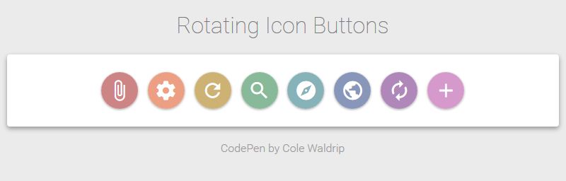
Puedes ver el código utilizado, así como una demo de su funcionamiento en la página web del autor del código http://codepen.io/colewaldrip/pen/bdZVGd