Con CSS, jQuery y SVG conseguirás tener un efecto precarga con animación en tu página web. Si quieres que tus visitantes se queden mientras carga la página web, este plugin es un buen método para ello.
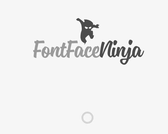
Es un tutorial donde podrás aprender paso a paso a crear tu propio efecto precarga. La idea de este tutorial vino de la página web de Fontface Ninja, donde se puede ver un bonito efecto precarga.
Este es un resumen del tutorial oficial que lo puedes ver íntegro y en inglés en Codrops.
Insertar el código HTML
Dentro del HTML crearemos un div ip-container que incluirá el logo y el efecto precarga.
<div id="ip-container" class="ip-container">

	<!-- initial header -->
	<header class="ip-header">

		<h1 class="ip-logo">
			<svg class="ip-inner" width="100%" height="100%" viewBox="0 0 300 160" preserveAspectRatio="xMidYMin meet" aria-labelledby="logo_title">
				<title id="logo_title">Delightful Demonstrations by Codrops</title>
				<path d="...our super-long path..." />
			</svg>
		</h1>

		<div class="ip-loader">
			<svg class="ip-inner" width="60px" height="60px" viewBox="0 0 80 80">
				<path class="ip-loader-circlebg" d="M40,10C57.351,10,71,23.649,71,40.5S57.351,71,40.5,71 S10,57.351,10,40.5S23.649,10,40.5,10z"/>
				<path id="ip-loader-circle" class="ip-loader-circle" d="M40,10C57.351,10,71,23.649,71,40.5S57.351,71,40.5,71 S10,57.351,10,40.5S23.649,10,40.5,10z"/>
			</svg>
		</div>

	</header>

	<!-- main content -->
	<div class="ip-main">

		<h2>Make yourself at home.</h2>

		<div class="browser clearfix">
			<div class="box">
				<span class="icon-bell"></span>
				<p>...</p>
			</div>
			<div class="box">
				<span class="icon-heart"></span>
				<p>...</p>
			</div>
			<div class="box">
				<span class="icon-cog"></span>
				<p>...</p>
			</div>
		</div>

	</div>
</div><!-- /container -->
Creando el CSS
En este tutorial se utilizan de iconos los de Feather icon set, fuentes de iconos de IcoMoon app y de fuente la Blokk, que es una tipografía muy usada en mock-ups y wireframes.
@font-face {
	font-weight: normal;
	font-style: normal;
	font-family: 'Blokk';
	src: url('../fonts/blokk/BLOKKRegular.eot');
	src: url('../fonts/blokk/BLOKKRegular.eot?#iefix') format('embedded-opentype'),
		 url('../fonts/blokk/BLOKKRegular.woff') format('woff'),
		 url('../fonts/blokk/BLOKKRegular.svg#BLOKKRegular') format('svg');
}

@font-face {
	font-weight: normal;
	font-style: normal;
	font-family: 'feather';
	src:url('../fonts/feather/feather.eot?-9jv4cc');
	src:url('../fonts/feather/feather.eot?#iefix-9jv4cc') format('embedded-opentype'),
		url('../fonts/feather/feather.woff?-9jv4cc') format('woff'),
		url('../fonts/feather/feather.ttf?-9jv4cc') format('truetype'),
		url('../fonts/feather/feather.svg?-9jv4cc#feather') format('svg');
}
.ip-header {
	position: fixed;
	top: 0;
	z-index: 100;
	min-height: 480px;
	width: 100%;
	height: 100%;
	background: #f1f1f1;
}
.ip-header h1 {
	margin: 0;
}
.ip-logo,
.ip-loader {
	position: absolute;
	left: 0;
	width: 100%;
	opacity: 0;
	cursor: default;
	pointer-events: none;
}
.ip-logo {
	top: 0;
	height: 100%;
	transform: translate3d(0,25%,0);
}
.ip-loader {
	bottom: 20%;
}
.ip-header .ip-inner {
	display: block;
	margin: 0 auto;
}
.ip-header .ip-logo svg {
	min-width: 320px;
	max-width: 480px;
	width: 25%;
}
.ip-header .ip-logo svg path {
	fill: #ef6e7e;
}
.ip-header .ip-loader svg path {
	fill: none;
	stroke-width: 6;
}
.ip-header .ip-loader svg path.ip-loader-circlebg {
	stroke: #ddd;
}
.ip-header .ip-loader svg path.ip-loader-circle {
	transition: stroke-dashoffset 0.2s;
	stroke: #ef6e7e;
}
.ip-main {
	overflow: hidden;
	margin: 0 auto;
	padding: 160px 0 10em 0;
	max-width: 1100px;
	width: 90%;
}
.ip-main h2 {
	margin: 0;
	padding: 0.5em 0 1em;
	color: #be4856;
	text-align: center;
	font-size: 4.25em;
	font-size: 4vw;
	line-height: 1;
}
.browser {
	margin: 0 auto;
	padding-top: 8%;
	min-height: 400px;
	max-width: 1000px;
	width: 100%;
	border-radius: 8px;
	background: #fff url(../img/browser.png) no-repeat 50% 0;
	background-size: 100%;
	color: #d3d3d3;
}
.box {
	float: left;
	padding: 3.5em;
	width: 33.3%;
	font-size: 0.7em;
	line-height: 1.5;
}

.box p {
	font-family: 'Blokk', Arial, sans-serif;
}
[class^="icon-"]::before,
[class*=" icon-"]::before {
	display: block;
	margin-bottom: 0.5em;
	padding: 0.5em;
	border-radius: 5px;
	background: #dfdfdf;
	color: #fff;
	text-align: center;
	text-transform: none;
	font-weight: normal;
	font-style: normal;
	font-variant: normal;
	font-size: 5em;
	font-family: 'feather';
	line-height: 1;
	speak: none;
	-webkit-font-smoothing: antialiased;
	-moz-osx-font-smoothing: grayscale;
}

.icon-bell:before {
	content: "e006";
}

.icon-cog:before {
	content: "e023";
}

.icon-heart:before {
	content: "e024";
}
.loading .ip-logo,
.loading .ip-loader {
	opacity: 1;
	animation: animInitialHeader 1s cubic-bezier(0.7,0,0.3,1) both;
}

.loading .ip-loader {
	animation-delay: 0.2s;
}

@keyframes animInitialHeader {
	from {
		opacity: 0;
		transform: translate3d(0,800px,0);
	}
}
.loaded .ip-logo,
.loaded .ip-loader {
	opacity: 1;
}

.loaded .ip-logo {
	transform-origin: 50% 0;
	animation: animLoadedLogo 1s cubic-bezier(0.7,0,0.3,1) forwards;
}

@keyframes animLoadedLogo {
	to {
		transform: translate3d(0,100%,0) translate3d(0,50px,0) scale3d(0.65,0.65,1);
	}
}

.loaded .ip-logo svg path {
	transition: all 0.5s ease 0.3s;
	fill: #fff;
}

.loaded .ip-loader {
	animation: animLoadedLoader 0.5s cubic-bezier(0.7,0,0.3,1) forwards;
}

@keyframes animLoadedLoader {
	to {
		opacity: 0;
		transform: translate3d(0,-100%,0) scale3d(0.3,0.3,1);
	}
}
.loaded .ip-header {
	animation: animLoadedHeader 1s cubic-bezier(0.7,0,0.3,1) forwards;
}

@keyframes animLoadedHeader {
	to { transform: translate3d(0,-100%,0); }
}
/* Content animations */
.loaded .ip-main h2,
.loaded .ip-main .browser,
.loaded .ip-main .browser .box,
.loaded .codrops-demos {
	animation: animLoadedContent 1s cubic-bezier(0.7,0,0.3,1) both;
}

.loaded .ip-main .browser,
.loaded .ip-main .browser .box:first-child {
	animation-delay: 0.1s;
}

.loaded .ip-main .browser .box:nth-child(2) {
	animation-delay: 0.15s;
}

.loaded .ip-main .browser .box:nth-child(3) {
	animation-delay: 0.2s;
}

@keyframes animLoadedContent {
	from {
		opacity: 0;
		transform: translate3d(0,200px,0);
	}
}
.layout-switch .ip-header {
	position: absolute;
}
.no-js .ip-header {
	position: relative;
	min-height: 0px;
}

.no-js .ip-header .ip-logo {
	margin-top: 20px;
	height: 180px;
	opacity: 1;
	transform: none;
}

.no-js .ip-header .ip-logo svg path {
	fill: #fff;
}
@media screen and (max-width: 45em) {

	.ip-main h2 {
		font-size: 2.25em;
		font-size: 10vw;
	}

	.box {
		width: 100%%;
	}

}
Y con esto están todos los estilos.
El Javascript
Cargamos las funciones necesarias para conseguir el efecto.
function PathLoader( el ) {
	this.el = el;
	// clear stroke
	this.el.style.strokeDasharray = this.el.style.strokeDashoffset = this.el.getTotalLength();
}

PathLoader.prototype._draw = function( val ) {
	this.el.style.strokeDashoffset = this.el.getTotalLength() * ( 1 - val );
}

PathLoader.prototype.setProgress = function( val, callback ) {
	this._draw(val);
	if( callback && typeof callback === 'function' ) {
		// give it a time (ideally the same like the transition time) so that the last progress increment animation is still visible.
		setTimeout( callback, 200 );
	}
}

PathLoader.prototype.setProgressFn = function( fn ) {
	if( typeof fn === 'function' ) { fn( this ); }
}
var simulationFn = function(instance) {
	var progress = 0,
		interval = setInterval( function() {
			progress = Math.min( progress + Math.random() * 0.1, 1 );
			instance.setProgress( progress );
			// reached the end
			if( progress === 1 ) {
				clearInterval( interval );
			}
		}, 100 );
};

var loader = new PathLoader([pathselector]);
loader.setProgressFn(simulationFn);
var support = { animations : Modernizr.cssanimations },
	container = document.getElementById( 'ip-container' ),
	header = container.querySelector( 'header.ip-header' ),
	loader = new PathLoader( document.getElementById( 'ip-loader-circle' ) ),
	animEndEventNames = { 'WebkitAnimation' : 'webkitAnimationEnd', 'OAnimation' : 'oAnimationEnd', 'msAnimation' : 'MSAnimationEnd', 'animation' : 'animationend' },
	// animation end event name
	animEndEventName = animEndEventNames[ Modernizr.prefixed( 'animation' ) ];
function init() {
	var onEndInitialAnimation = function() {
		if( support.animations ) {
			this.removeEventListener( animEndEventName, onEndInitialAnimation );
		}

		startLoading();
	};

	// disable scrolling
	window.addEventListener( 'scroll', noscroll );

	// initial animation
	classie.add( container, 'loading' );

	if( support.animations ) {
		container.addEventListener( animEndEventName, onEndInitialAnimation );
	}
	else {
		onEndInitialAnimation();
	}
}

// no scroll
function noscroll() {
	window.scrollTo( 0, 0 );
}
function startLoading() {
	// simulate loading something..
	var simulationFn = function(instance) {
		var progress = 0,
			interval = setInterval( function() {
				progress = Math.min( progress + Math.random() * 0.1, 1 );

				instance.setProgress( progress );

				// reached the end
				if( progress === 1 ) {
					classie.remove( container, 'loading' );
					classie.add( container, 'loaded' );
					clearInterval( interval );

					var onEndHeaderAnimation = function(ev) {
						if( support.animations ) {
							if( ev.target !== header ) return;
							this.removeEventListener( animEndEventName, onEndHeaderAnimation );
						}

						classie.add( document.body, 'layout-switch' );
						window.removeEventListener( 'scroll', noscroll );
					};

					if( support.animations ) {
						header.addEventListener( animEndEventName, onEndHeaderAnimation );
					}
					else {
						onEndHeaderAnimation();
					}
				}
			}, 80 );
	};

	loader.setProgressFn( simulationFn );
}
Y con esto estaría conseguido todo el efecto precarga. Bieeeeeeen!!!
En tympanus puedes ver una demo, así como descargarte todo este código.
Si te ha gustado el artículo de esta precarga jQuery solo tienes que animarte a comentar y recomendarlo a través de las redes sociales 🙂